Color

Set color legend for variables.
Description
The Color widget enables you to set the color legend in your visualizations according to your own preferences. This option provides you with the tools for emphasizing your results and offers a great variety of color options for presenting your data. It can be combined with most visualizations widgets.
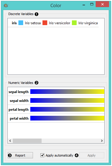
- A list of discrete variables. You can set the color of each variable by double-clicking on it and opening the Color palette or the Select color window. The widget also enables text-editing. By clicking on a variable, you can change its name.
- A list of continuous variables. You can customize the color gradients by double-clicking on them. The widget also enables text-editing. By clicking on a variable, you can change its name. If you hover over the right side side of the gradient, Copy to all appears. You can then apply your customized color gradient to all variables.
- Produce a report.
- Apply changes. If Apply automatically is ticked, changes will be communicated automatically. Alternatively, just click Apply.
Discrete variables
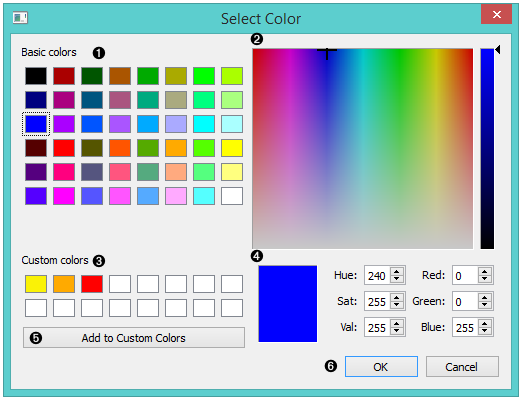
- Choose a desired color from the palette of basic colors.
- Move the cursor to choose a custom color from the color palette.
- Choose a custom color from your previously saved color choices.
- Specify the custom color by:
- entering the red, green, and blue components of the color as values between 0 (darkest) and 255 (brightest)
- entering the hue, saturation and luminescence components of the color as values in the range 0 to 255
- Add the created color to your custom colors.
- Click OK to save your choices or Cancel to exit the the color palette.
Numeric variables
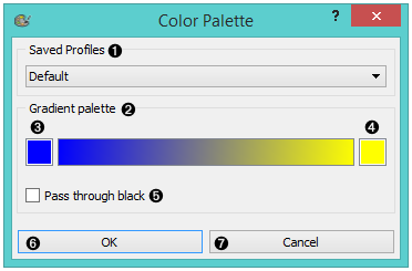
- Choose a gradient from your saved profiles. The default profile is already set.
- The gradient palette
- Select the left side of the gradient. Double clicking the color opens the Select Color window.
- Select the right side of the gradient. Double clicking the color opens the Select Color window.
- Pass through black.
- Click OK to save your choices or Cancel to exit the color palette.
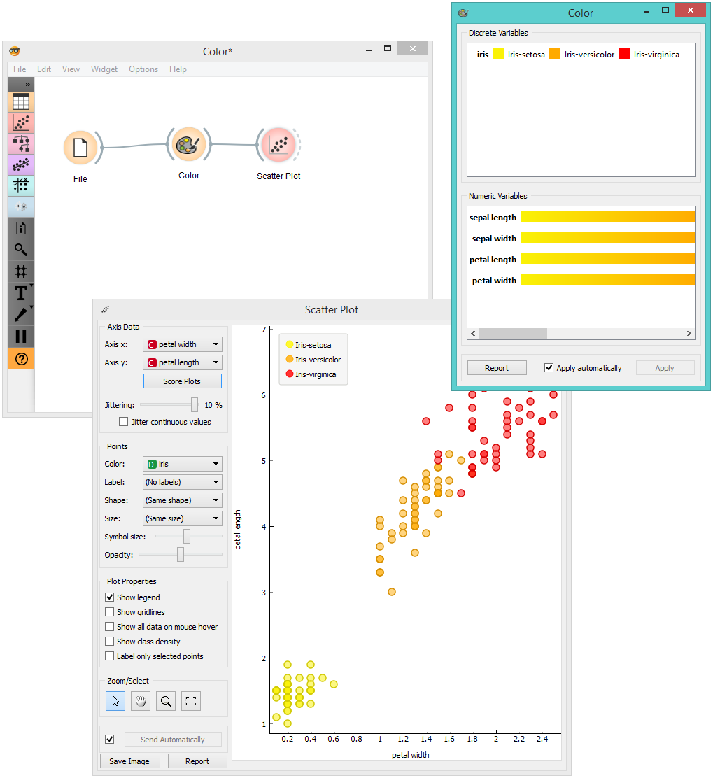
Example
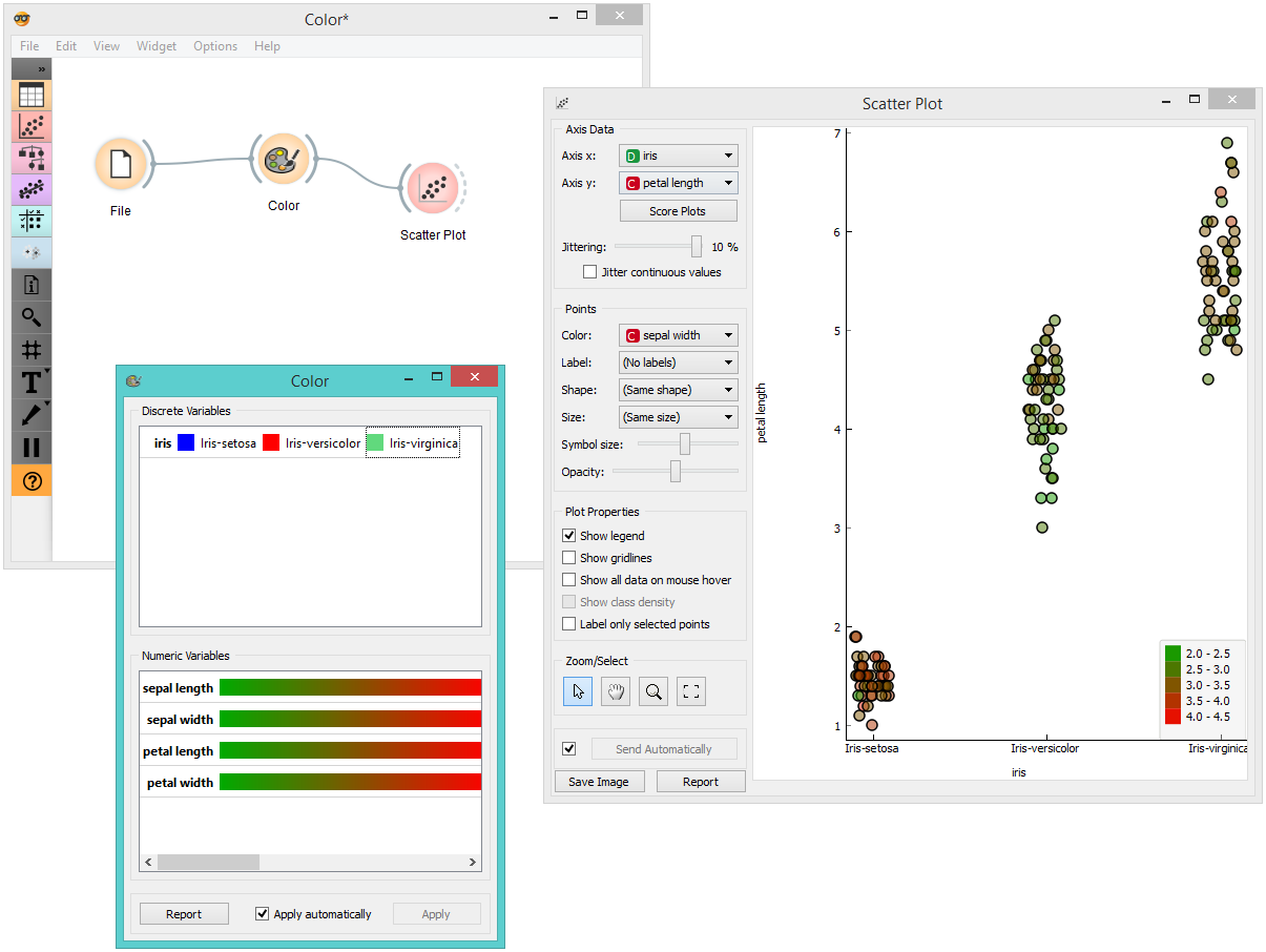
We chose to work with the Iris data set. We opened the color palette and selected three new colors for the three types of Irises. Then we opened the Scatter Plot widget and viewed the changes made to the scatter plot.
For our second example, we wished to demonstrate the use of the Color widget with continuous variables. We put different types of Irises on the x axis and petal length on the y axis. We created a new color gradient and named it greed (green + red). In order to show that sepal length is not a deciding factor in differentiating between different types of Irises, we chose to color the points according to sepal width.