Scatter Plot

Scatterplot visualization with explorative analysis and intelligent data visualization enhancements.
Signals
Inputs:
Data
An input data set.
Data Subset
A subset of instances from the input data set.
Features
A list of attributes.
Outputs:
Selected Data
A subset of instances that the user manually selected from the scatterplot.
Data
Data with an additional column showing whether a point is selected.
Description
The Scatterplot widget provides a 2-dimensional scatterplot visualization for both continuous and discrete-valued attributes. The data is displayed as a collection of points, each having the value of the x-axis attribute determining the position on the horizontal axis and the value of the y-axis attribute determining the position on the vertical axis. Various properties of the graph, like color, size and shape of the points, axis titles, maximum point size and jittering can be adjusted on the left side of the widget. A snapshot below shows the scatterplot of the Iris data set with the coloring matching of the class attribute.
- Select the x and y attribute. Optimize your projection by using Rank Projections. This feature scores attribute pairs by average classification accuracy and returns the top scoring pair with a simultaneous visualization update. Set jittering to prevent the dots overlapping. If Jitter continuous values is ticked, continuous instances will be dispersed.
- Set the color of the displayed points (you will get colors for discrete values and grey-scale points for continuous). Set label, shape and size to differentiate between points. Set symbol size and opacity for all data points. Set the desired colors scale.
- Adjust plot properties:
- Show legend displays a legend on the right. Click and drag the legend to move it.
- Show gridlines displays the grid behind the plot.
- Show all data on mouse hover enables information bubbles if the cursor is placed on a dot.
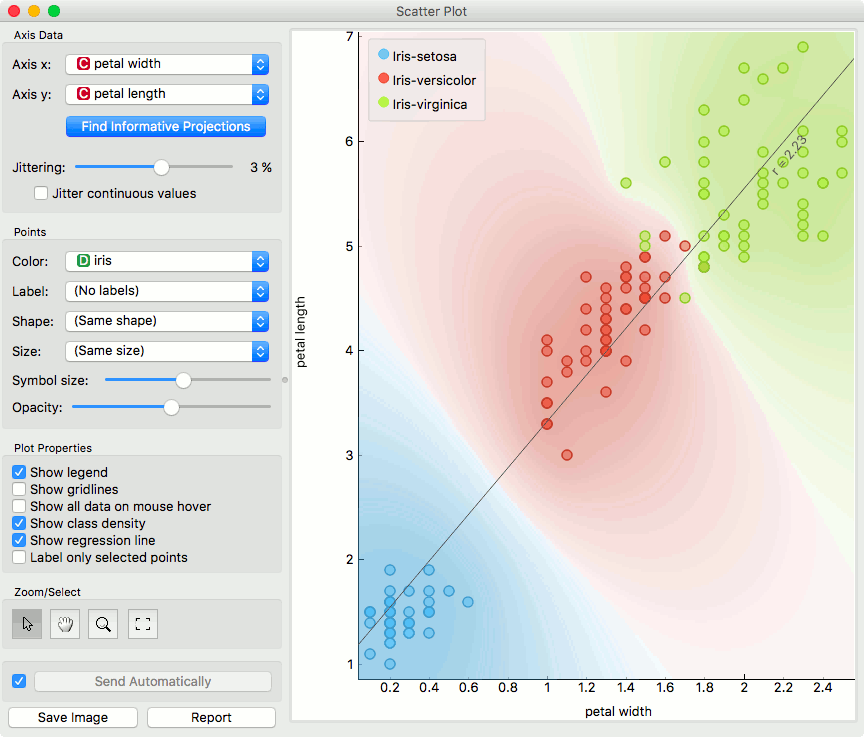
- Show class density colors the graph by class (see the screenshot below).
- Show regression line draws the regression line for pair of continuous attributes.
- Label only selected points allows you to select individual data instances and label them.
- Select, zoom, pan and zoom to fit are the options for exploring the graph. The manual selection of data instances works as an angular/square selection tool. Double click to move the projection. Scroll in or out for zoom.
- If Send automatically is ticked, changes are communicated automatically. Alternatively, press Send.
- Save Image saves the created image to your computer in a .svg or .png format.
- Produce a report.
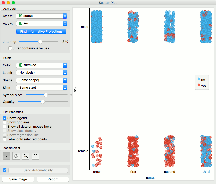
For discrete attributes, jittering circumvents the overlap of points which have the same value for both axes, and therefore the density of points in the region corresponds better to the data. As an example, the scatterplot for the Titanic data set, reporting on the gender of the passengers and the traveling class is shown below; without jittering, the scatterplot would display only eight distinct points.
Here is an example of the Scatter Plot widget if the Show class density and Show regression line boxes are ticked.
Intelligent Data Visualization
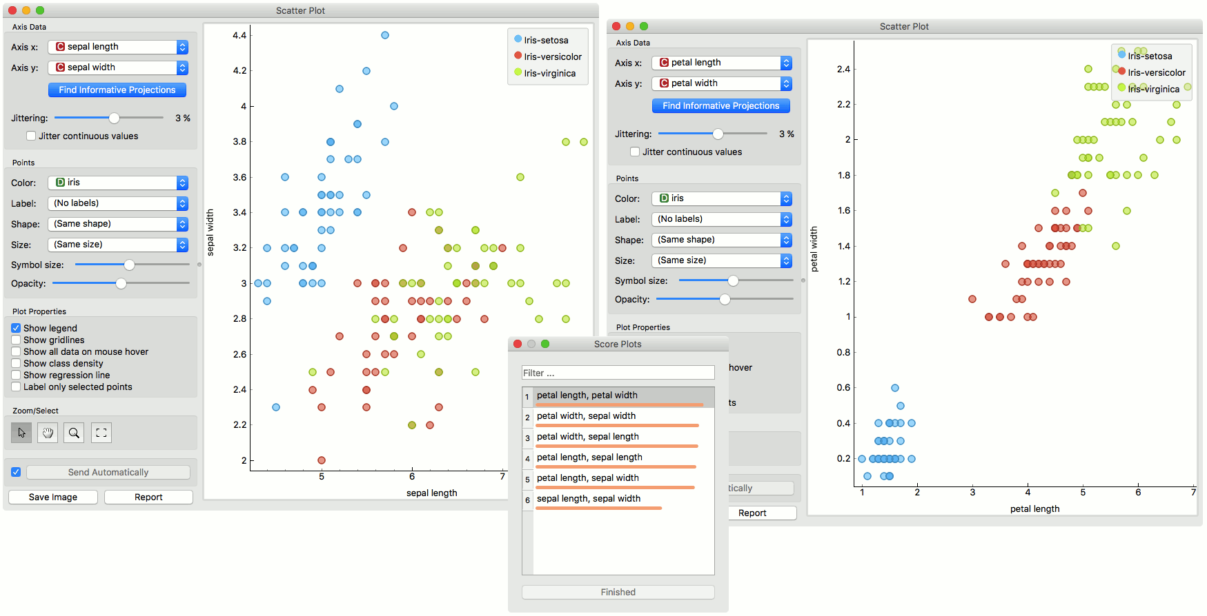
If a data set has many attributes, it is impossible to manually scan through all the pairs to find interesting or useful scatterplots. Orange implements intelligent data visualization with the Find Informative Projections option in the widget. The goal of optimization is to find scatterplot projections where instances are well separated.
To use this method, go to the Find Informative Projections option in the widget, open the subwindow and press Start Evaluation. The feature will return a list of attribute pairs by average classification accuracy score.
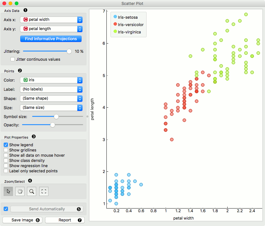
Below, there is an example demonstrating the utility of ranking. The first scatterplot projection was set as the default sepal width to sepal length plot (we used the Iris data set for simplicity). Upon running Find Informative Projections optimization, the scatterplot converted to a much better projection of petal width to petal length plot.
Selection
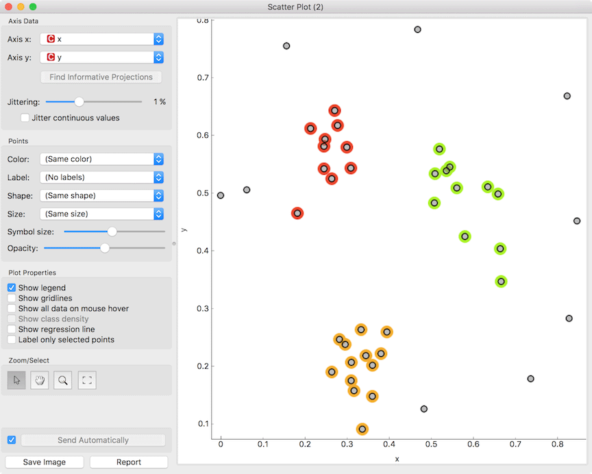
Selection can be used to manually defined subgroups in the data. Use Shift modifier when selecting data instances to put them into a new group. Shift + Ctrl (or Shift + Cmd on macOs) appends instances to the last group.
Signal data outputs a data table with an additional column that contains group indices.
Explorative Data Analysis
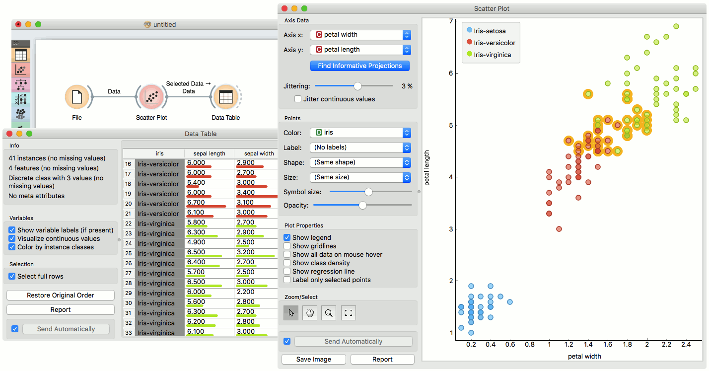
The Scatterplot, as the rest of Orange widgets, supports zooming-in and out of part of the plot and a manual selection of data instances. These functions are available in the lower left corner of the widget. The default tool is Select, which selects data instances within the chosen rectangular area. Pan enables you to move the scatterplot around the pane. With Zoom you can zoom in and out of the pane with a mouse scroll, while Reset zoom resets the visualization to its optimal size. An example of a simple schema, where we selected data instances from a rectangular region and sent them to the Data Table widget, is shown below. Notice that the scatterplot doesn’t show all 52 data instances, because some data instances overlap (they have the same values for both attributes used).
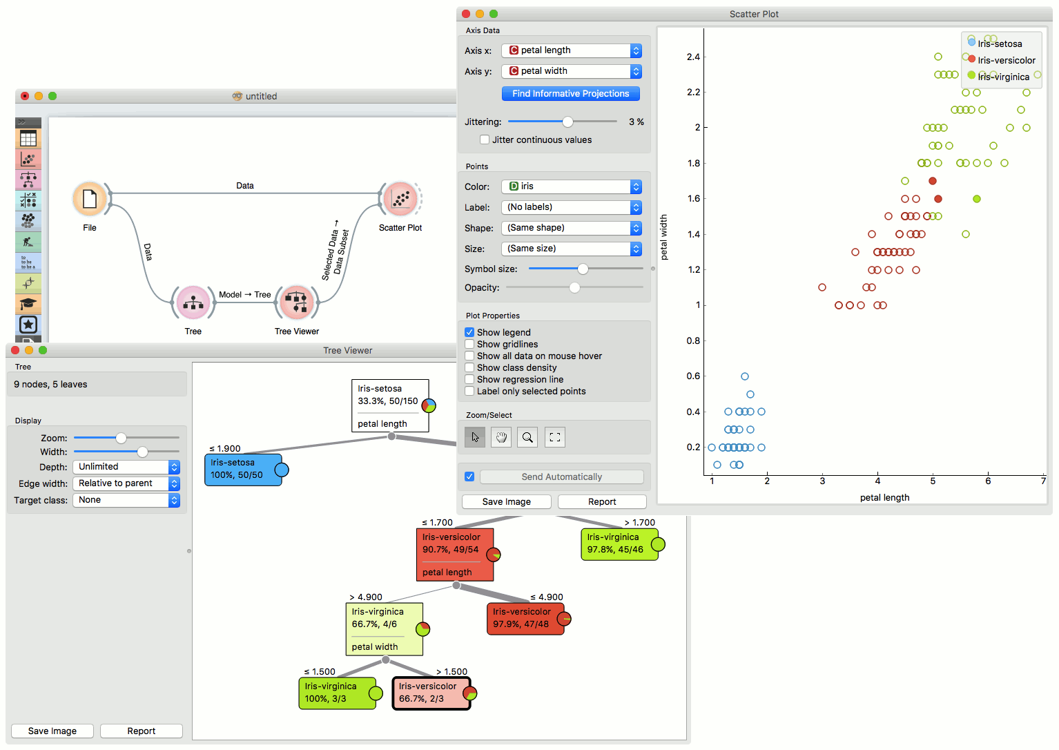
Example
The Scatterplot can be combined with any widget that outputs a list of selected data instances. In the example below, we combine Tree and Scatterplot to display instances taken from a chosen decision tree node (clicking on any node of the tree will send a set of selected data instances to the scatterplot and mark selected instances with filled symbols).