Venn Diagram

Plots a Venn diagram for two or more data subsets.
Signals
Inputs:
Data
An input data set
Outputs:
Selected Data
A subset of instances that the user has manually selected from the diagram.
Description
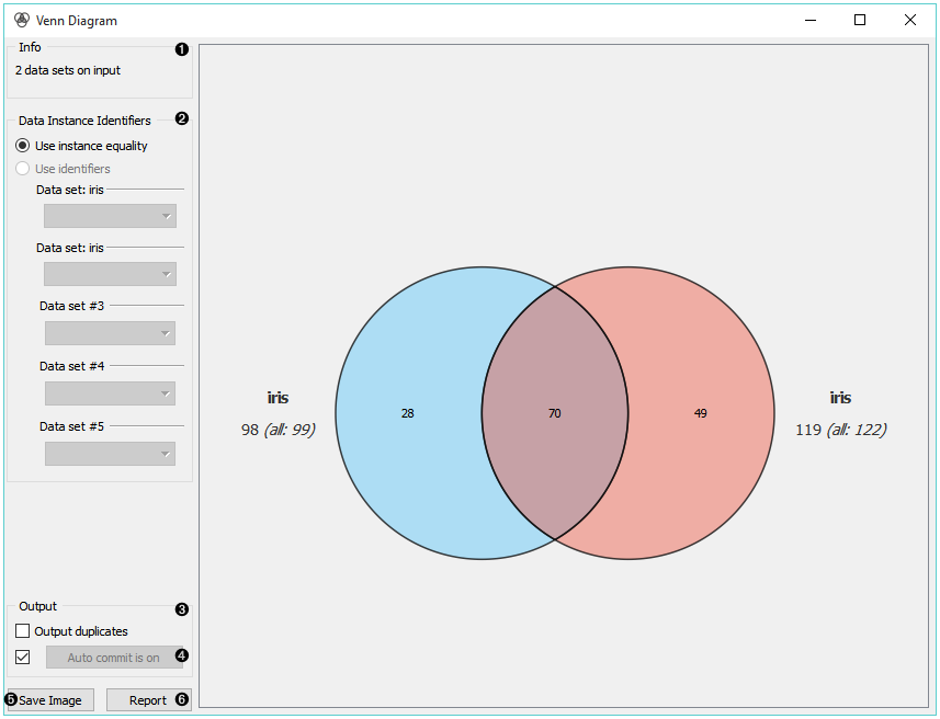
The Venn Diagram widget displays logical relations between data sets. This projection shows two or more data sets represented by circles of different colors. The intersections are subsets that belong to more than one data set. To further analyze or visualize the subset, click on the intersection.
- Information on the input data.
- Select the identifiers by which to compare the data.
- Tick Output duplicates if you wish to remove duplicates.
- If Auto commit is on, changes are automatically communicated to other widgets. Alternatively, click Commit.
- Save Image saves the created image to your computer in a .svg or .png format.
- Produce a report.
Examples
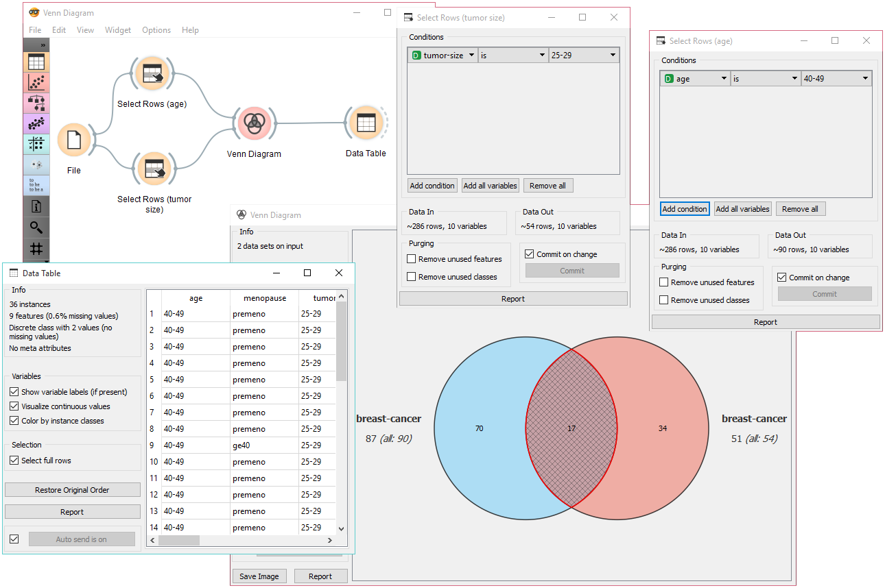
The easiest way to use the Venn Diagram is to select data subsets and find matching instances in the visualization. We use the breast-cancer data set to select two subsets with Select Rows widget - the first subset is that of breast cancer patients aged between 40 and 49 and the second is that of patients with a tumor size between 20 and 29. The Venn Diagram helps us find instances that correspond to both criteria, which can be found in the intersection of the two circles.
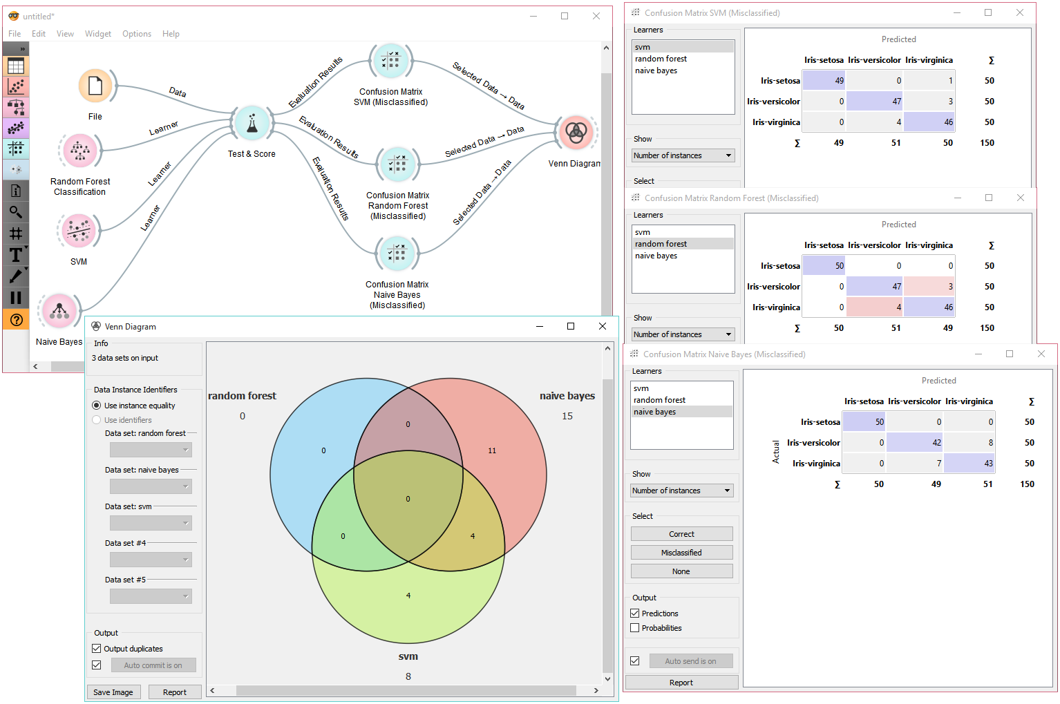
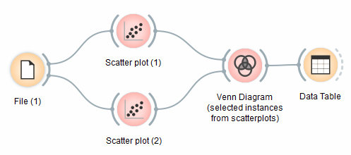
The Venn Diagram widget can be also used for exploring different prediction models. In the following example, we analysed 3 prediction methods, namely Naive Bayes, SVM and Random Forest, according to their misclassified instances. By selecting misclassifications in the three Confusion Matrix widgets and sending them to Venn diagram, we can see all the misclassification instances visualized per method used. Then we open Venn Diagram and select, for example, the misclassified instances that were identified by all three methods (in our case 2). This is represented as an intersection of all three circles. Click on the intersection to see this two instances marked in the Scatterplot widget. Try selecting different diagram sections to see how the scatterplot visualization changes.