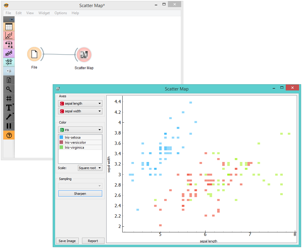
Scatter Map

Plots a scatter map for a pair of continuous attributes.
Description
A Scatter map is a graphical method for visualizing frequencies in a two-way matrix by color. The higher the occurrence of a certain value, the darker the represented color. By combining two values on x and y axes, we see where the attribute combination is the strongest and where the weakest, thus enabling the user to find strong correlations or representative instances.
- Select the x and y attribute to be plotted.
- Color the plot by attribute. You can also select which attribute instances you wish to see in the visualization by clicking on them. At the bottom, you can select the color scale strength (linear, square root or logarithmic).
- Sampling is enabled only when the widget is connected to the SQL Table widget. You can set the sampling time for large data to speed up the analysis. Sharpen works for all data types and it will resize (sharpen) the squares in the plot.
- Save Image saves the created image to your computer in a .svg or .png format.
- Produce a report.
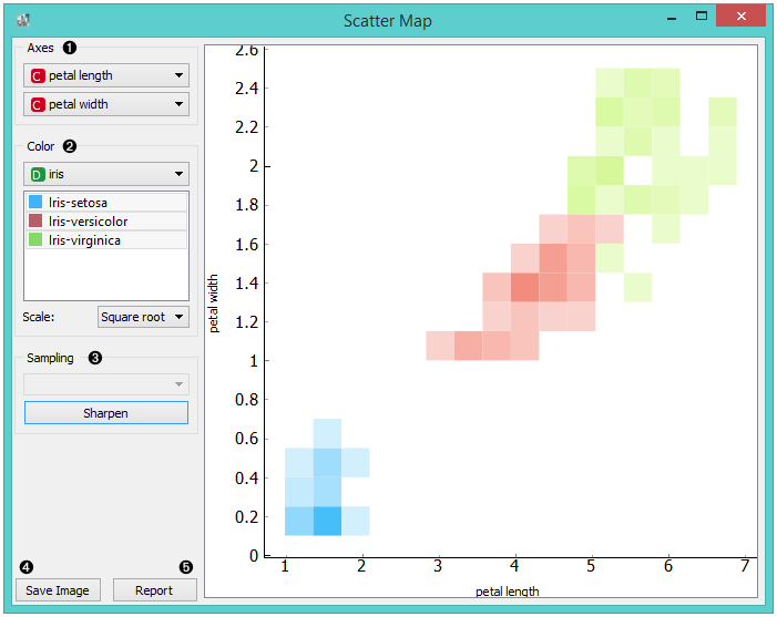
Example
Below, you can see an example workflow for the Scatter Map widget. Notice that the widget only works with continuous data, so you need to first continuize the data attributes you want to visualize. The Scatter map below displays two attributes from the Iris data set, namely the petal width and petal length. Here, we can see the distribution of width and length values per Iris type. You can see that the variety Iris setosa is distinctly separated from the other two varieties by petal width and length and that the most typical values for these attributes are around 0.2 for petal width and between 1.4 and 1.7 for petal length. This shows that petal width and length are good attributes for telling Iris setosa apart from the other two varieties.