Geo Map

Show data points on a world map.
Signals
Inputs:
Data
An input data set.
Data Subset
A subset of instances from the input data set.
Learner
A learning algorithm (classification or regression).
Outputs:
Selected Data
A subset of instances that the user has manually selected from the map.
Data
Data set with an appended meta attribute specifying selected and unselected data.
Description
Geo Map widget maps geo-spatial data on a world map. It only works on data sets containing latitude and longitude variables. It also enables class predictions when a learner is provided on the input.
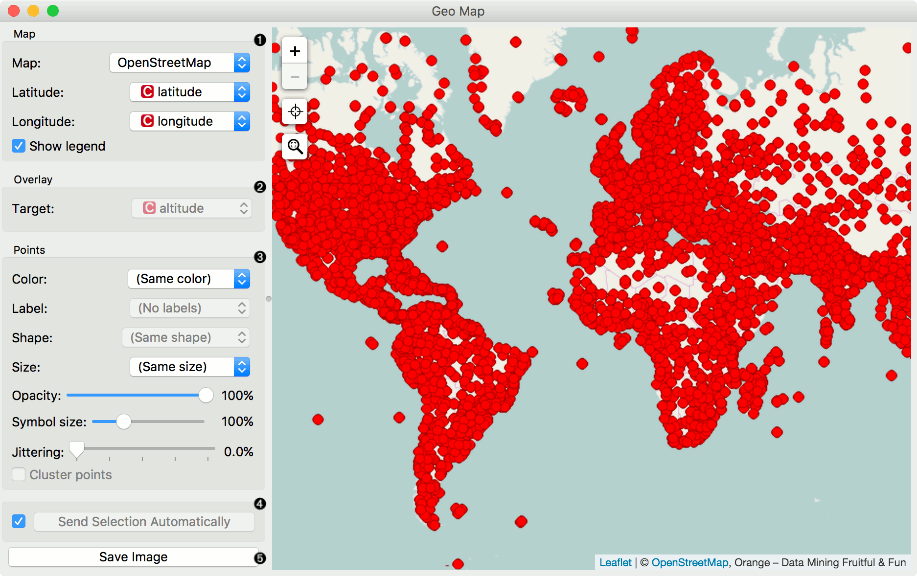
- Define map properties: - Set the type of map: Black and White, OpenStreetMap, Topographic, Satellite, Print, Light, Dark, Railyways and Watercolor. - Set latitude and longitude attributes, if the widget didn’t recognize them automatically. Latitude values should be between -90(S) and 90(N) and longitude values between -180(W) and 180(E).
- Overlay: - Set the target (class) for predictive mapping. A learner has to be provided on the input. The classifier is trained on latitude and longitude pairs only (i.e. it maps lat/lon pairs to the selected attribute).
- Set point parameters: - Color: color of data points by attribute values - Label: label data points with an attribute (available when zoomed in) - Shape: shape of data points by attribute (available when zoomed in) - Size: size of data points by attribute - Opacity: set transparency of data points - Symbol size: size of data points (small to large) - Jittering: disperse overlaid data points - Cluster points: cluster neighboring points with naive greedy clustering (available when less than 600 points are in view)
- If Send Selection Automatically is ticked, changes are communicated automatically. Alternatively, click Send Selection. Save image saves the image to your computer in a .svg or .png format.
Note
To select a subset of points from the map, hold Shift and draw a rectangle around the point you want to output.
Examples
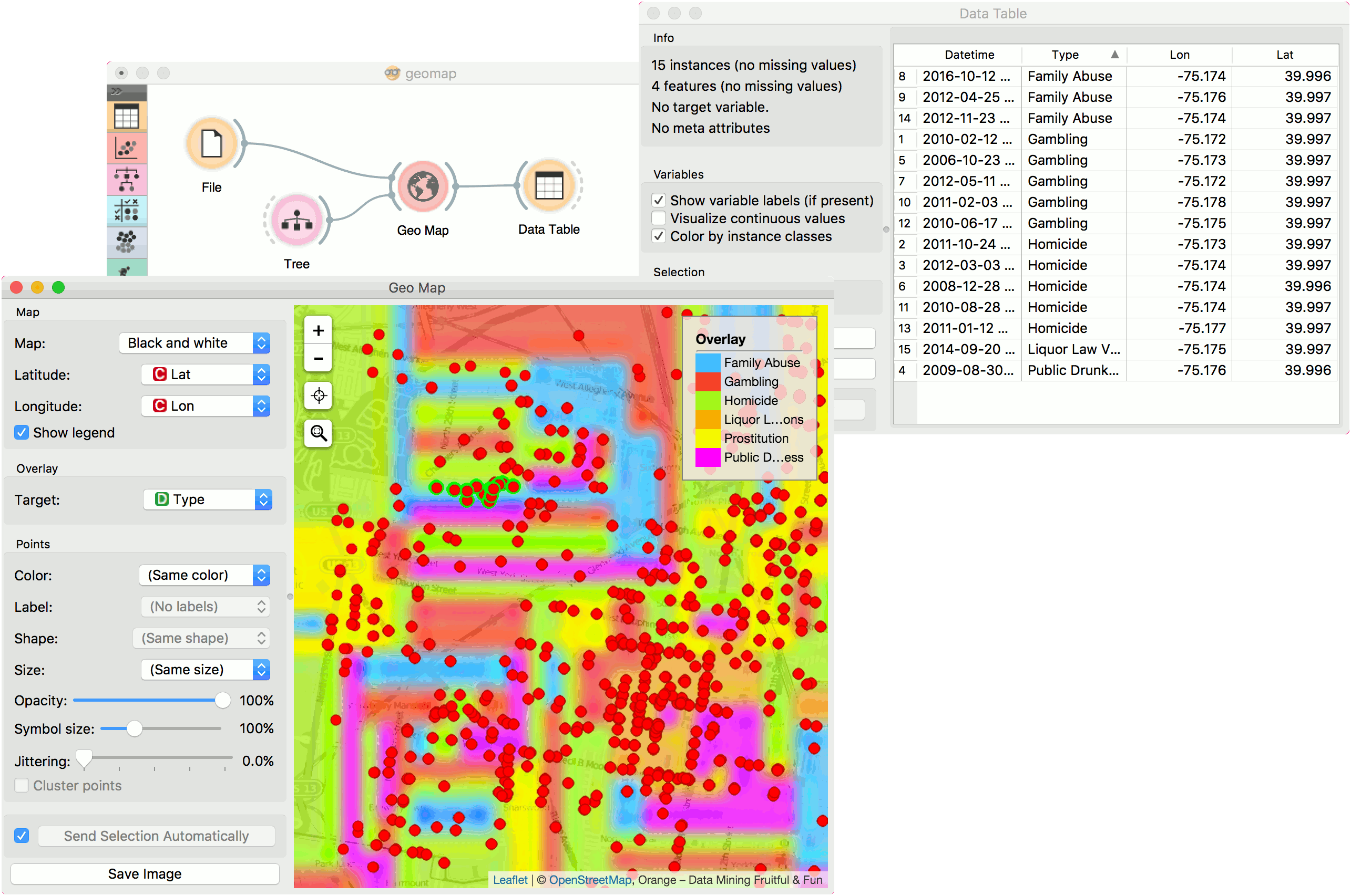
In the first example we will model class predictions on a map. We will use philadelphia-crime data set, load it with File widget and connect it to Map. We can already observe the mapped points in Map. Now, we connect Tree to Map and set target variable to Type. This will display the predicted type of crime for a specific region of Philadelphia city (each region will be colored with a corresponding color code, explained in a legend on the right).
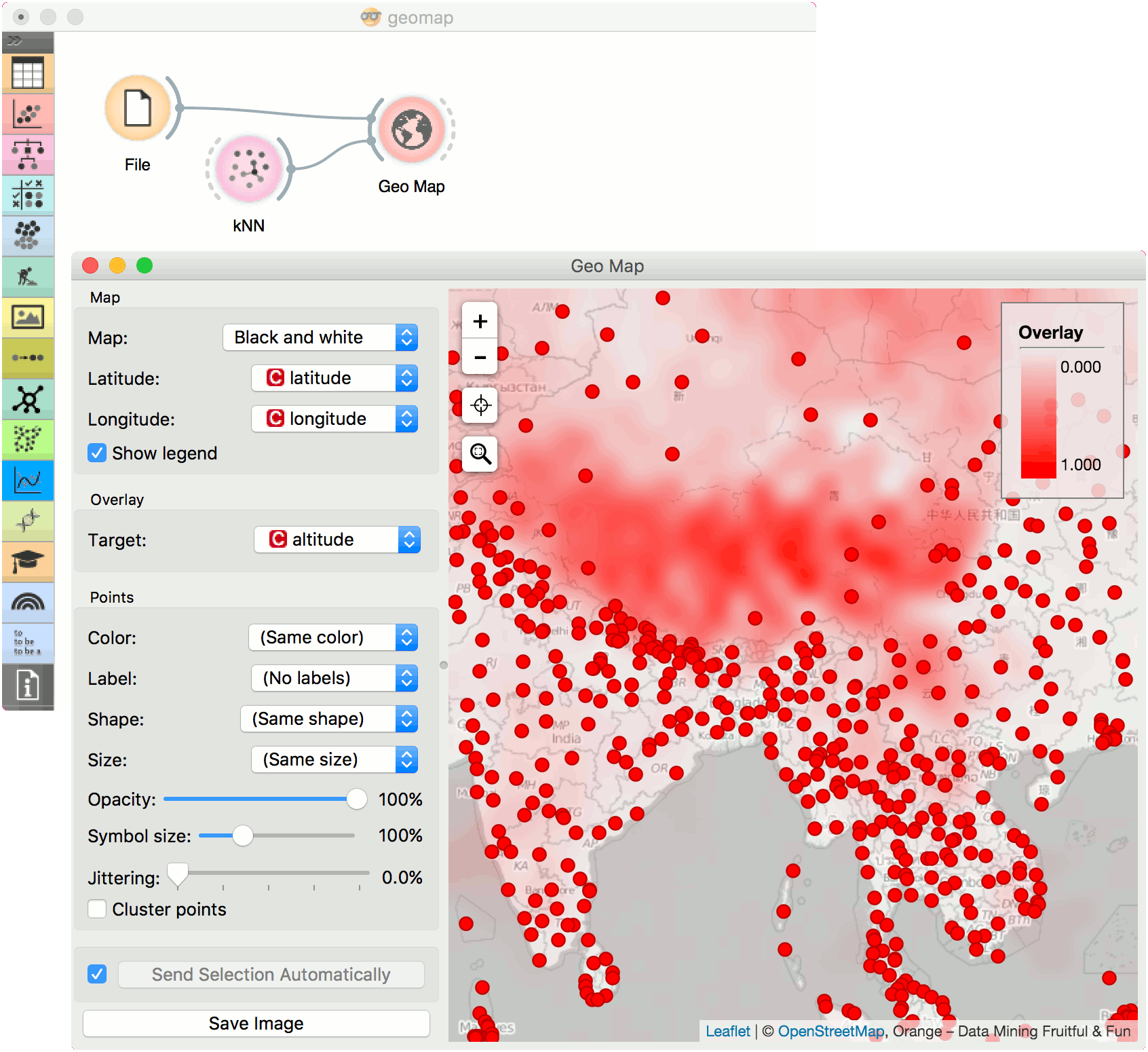
The second example uses global-airports.csv data. Say we somehow want to predict the altitude of the area based soley on the latitude and longitude. We again load the data with File widget and connect it to Map. Then we use a regressor, say, KNN and connect it to Map as well. Now we set target to altitude and use Black and White map type. The model guessed the Himalaya, but mades some errors elsewhere.