k-Means

Groups items using the k-Means clustering algorithm.
Description
The widget applies the k-Means clustering algorithm to the data and outputs a new data set in which the cluster index is used as a class attribute. The original class attribute, if it exists, is moved to meta attributes. Scores of clustering results for various k are also shown in the widget.
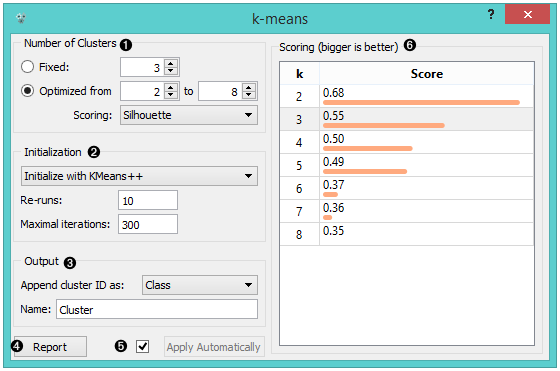
Select the number of clusters.
- Fixed: algorithm clusters data in a specified number of clusters.
- Optimized: widget shows clustering scores for the selected cluster range.
- Silhouette (contrasts average distance to elements in the same cluster with the average distance to elements in other clusters)
- Inter-cluster distance (measures distances between clusters, normally between centroids)
- Distance to centroids (measures distances to the arithmetic means of clusters)
Select the initialization method (the way the algorithm begins clustering):
- k-Means++ (first center is selected randomly, subsequent are chosen from the remaining points with probability proportioned to squared distance from the closest center)
- Random initialization (clusters are assigned randomly at first and then updated with further iterations)
Re-runs (how many times the algorithm is run) and maximal iterations (the maximum number of iteration within each algorithm run) can be set manually.
The widget outputs a new data set with appended cluster information. Select how to append cluster information (as class, feature or meta attribute) and name the column.
If Apply Automatically is ticked, the widget will commit changes automatically. Alternatively, click Apply.
Produce a report.
Check scores of clustering results for various k.
Examples
We are going to explore the widget with the following schema.
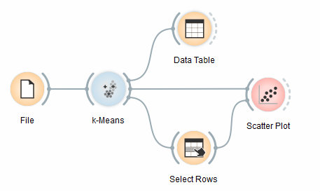
First, we load the Iris data set, divide it into three clusters and show it in the Data Table, where we can observe which instance went into which cluster. The interesting parts are the Scatter Plot and Select Rows.
Since k-Means added the cluster index as a class attribute, the scatter plot will color the points according to the clusters they are in.
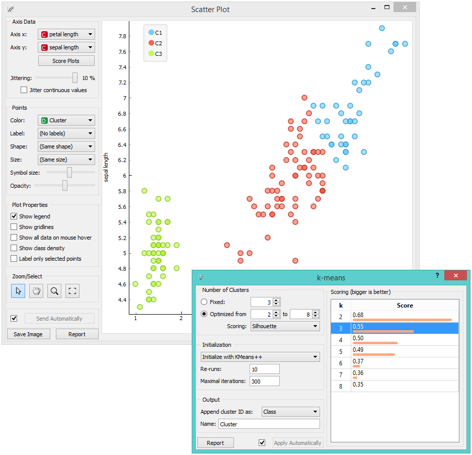
What we are really interested in is how well the clusters induced by the (unsupervised) clustering algorithm match the actual classes in the data. We thus take Select Rows widget, in which we can select individual classes and have the corresponding points marked in the scatter plot. The match is perfect for setosa, and pretty good for the other two classes.
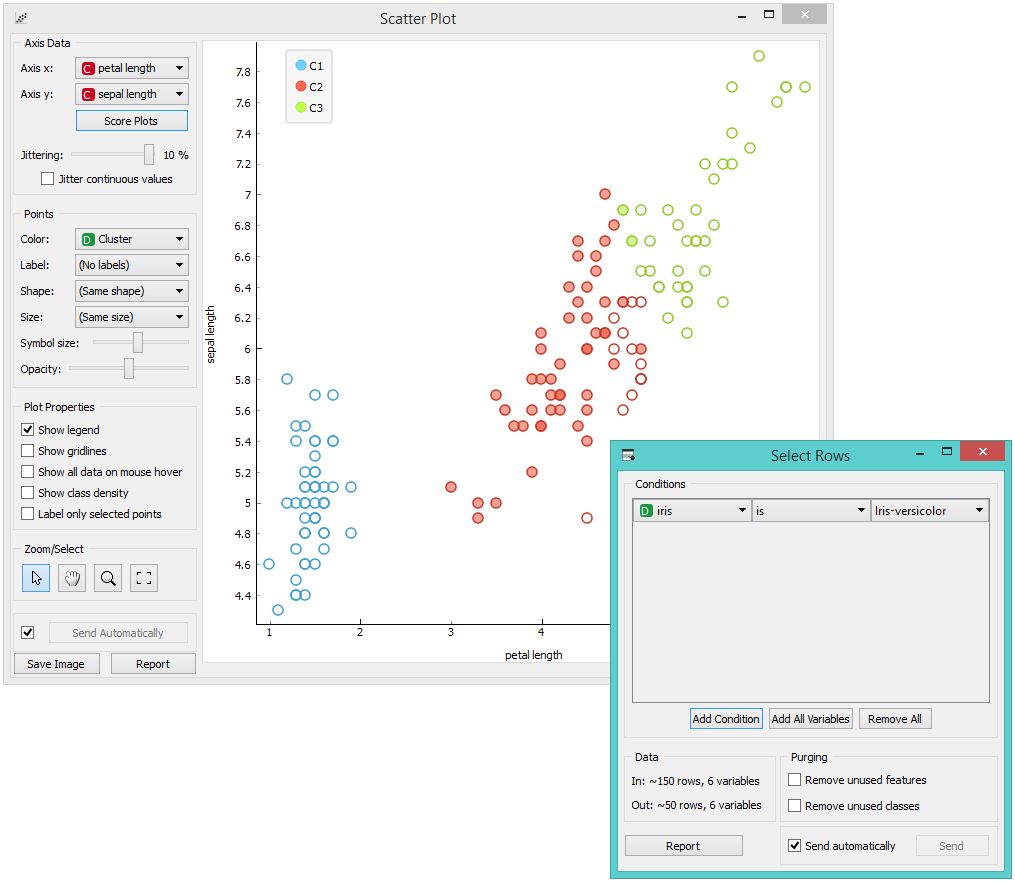
You may have noticed that we left the Remove unused values/attributes and Remove unused classes in Select Rows unchecked. This is important: if the widget modifies the attributes, it outputs a list of modified instances and the scatter plot cannot compare them to the original data.
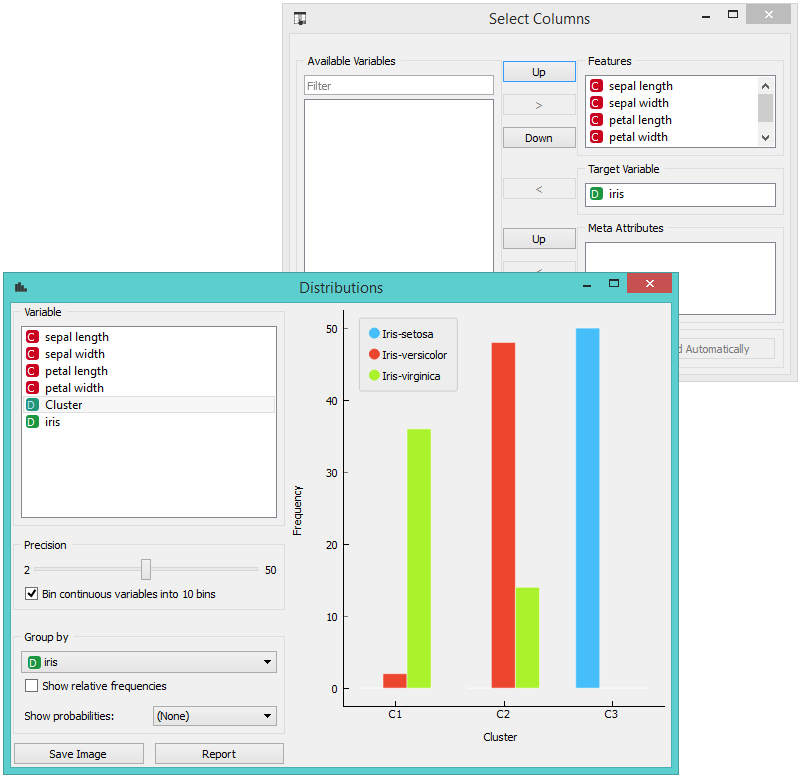
Perhaps a simpler way to test the match between clusters and the original classes is to use the Distributions widget.
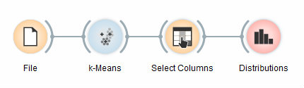
The only (minor) problem here is that this widget only visualizes normal (and not meta) attributes. We solve this by using Select Columns: we reinstate the original class Iris as the class and put the cluster index among the attributes.
The match is perfect for setosa: all instances of setosa are in the third cluster (blue). 48 versicolors are in the second cluster (red), while two ended up in the first. For virginicae, 36 are in the first cluster and 14 in the second.