Predictions

Shows models’ predictions on the data.
Signals
Inputs
Data
A data set.
Predictors
Predictors to be used on the data.
Outputs
Predictions
Original data with added predictions.
Description
The widget receives a data set and one or more predictors (classifiers, not learning algorithms - see the example below). It outputs the data and the predictions.
- Information on the input
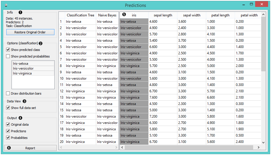
- The user can select the options for classification. If Show predicted class is ticked, the appended data table provides information on predicted class. If Show predicted probabilities is ticked, the appended data table provides information on probabilities predicted by the classifiers. The user can also select the predicted class he or she wants displayed in the appended data table. The option Draw distribution bars provides a nice visualization of the predictions.
- By ticking the Show full data set, the user can append the entire data table to the Predictions widget.
- Select the desired output.
- The appended data table
- Produce a report.
Despite its simplicity, the widget allows for quite an interesting analysis of decisions of predictive models; there is a simple demonstration at the bottom of the page. Confusion Matrix is a related widget and although many things can be done with any of them, there are tasks for which one of them might be much more convenient than the other. The output of the widget is another data set, where predictions are appended as new meta attributes. You can select which features you wish to output (original data, predictions, probabilities). The resulting data set can be appended to the widget, but you can still choose to display it in a separate data table.
Example
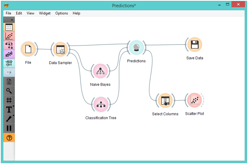
We randomly split the heart-disease data into two subsets. The larger subset, containing 70 % of data instances, is sent to Naive Bayes and Tree, so they can produce the corresponding model. Models are then sent into Predictions, among with the remaining 30 % of the data. Predictions shows how these examples are classified.
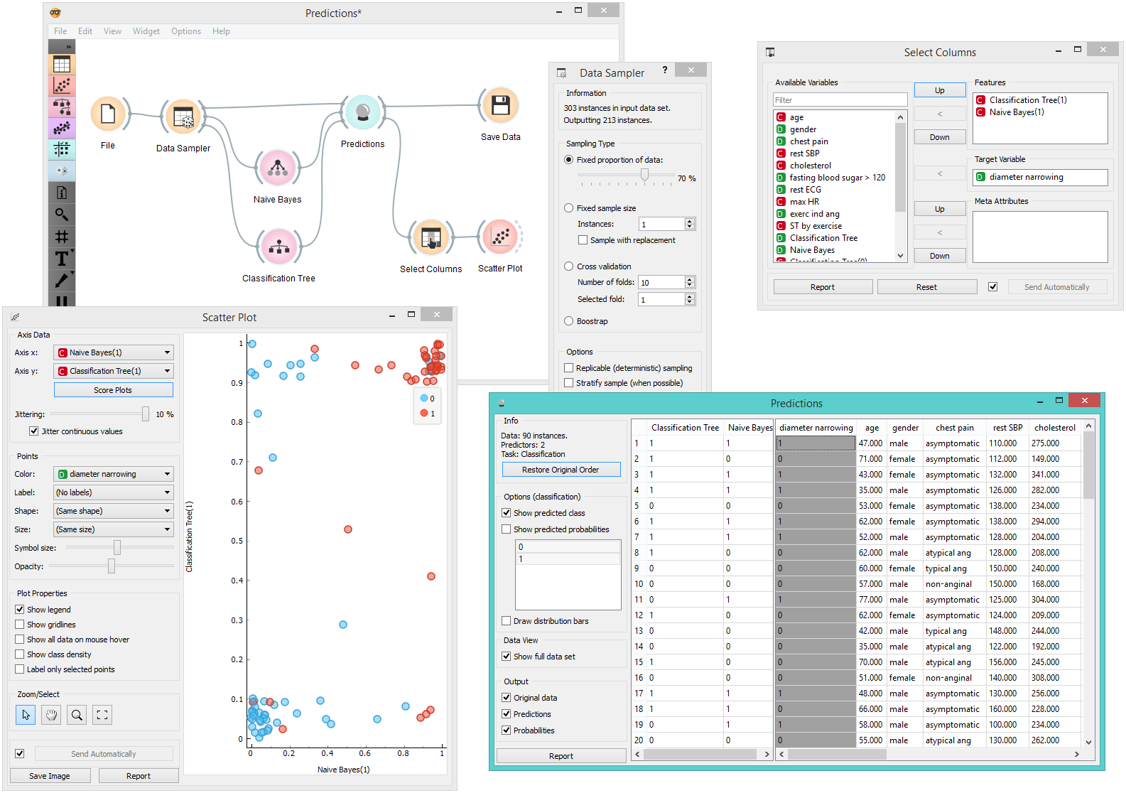
To save the predictions, we simply attach the Save widget to Predictions. The final file is a data table and can be saved as in a .tab or .tsv format.
Finally, we can analyze the models’ predictions. For that, we first take Select Columns with which we move the meta attributes with probability predictions to features. The transformed data is then given to the Scatterplot, which we set to use the attributes with probabilities as the x and y axes, while the class is (already by default) used to color the data points.
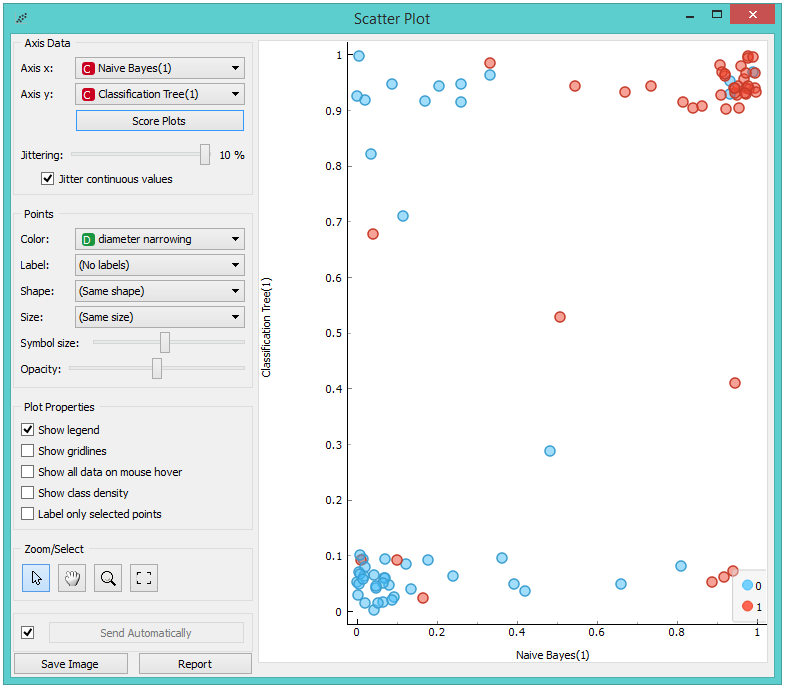
To get the above plot, we selected Jitter continuous values, since the decision tree gives just a few distinct probabilities. The blue points in the bottom left corner represent the people with no diameter narrowing, which were correctly classified by both models. The upper right red points represent the patients with narrowed vessels, which were correctly classified by both.
Note that this analysis is done on a rather small sample, so these conclusions may be ungrounded. Here is the entire workflow:
Another example of using this widget is given in the documentation for the widget Confusion Matrix.